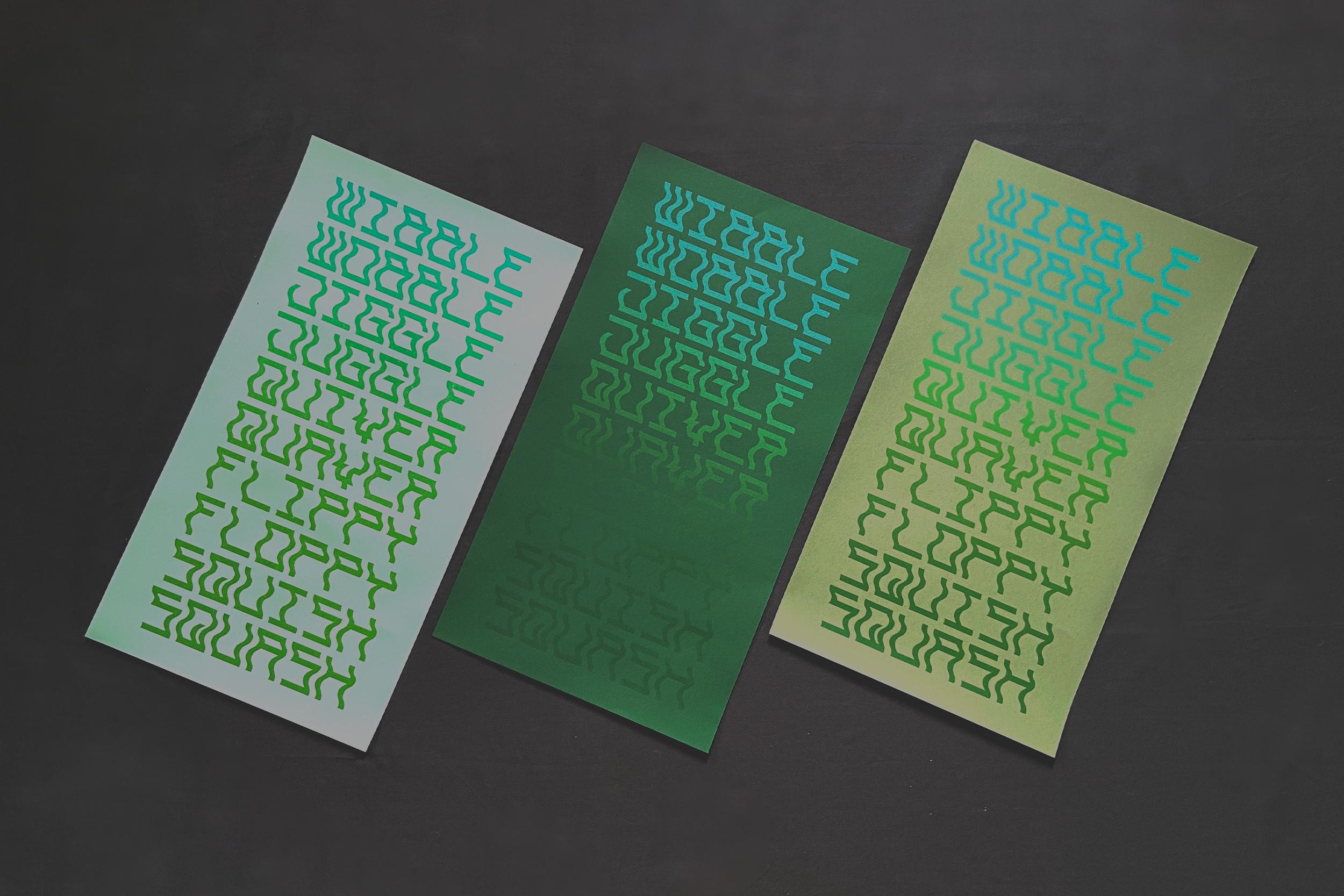

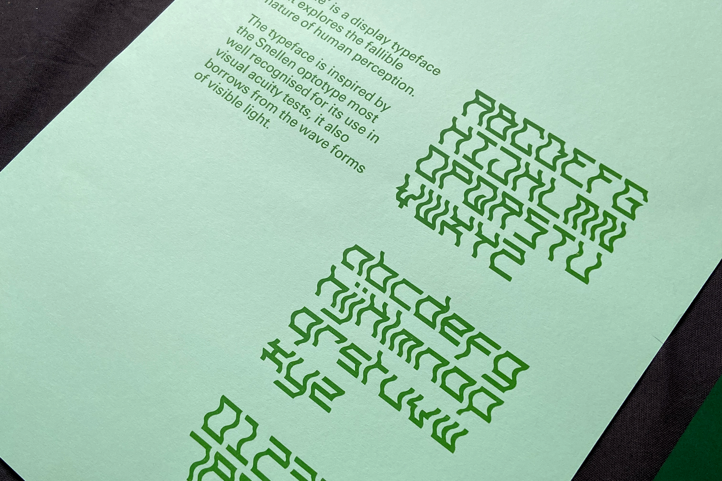

“Wibble” is a typeface design that highlights the fallible nature of human perception.
Initially designed for a publication exploring the differences between different designers, the typeface combines the structure of the Snellen Optotype, and the wave forms of visible light.
Working with London College Of Communication’s letterpress workshop I created a type specimen in multiple shades of green (the colour your eyes perceive the best).
Paper: GF Smith Colorplan
Typefaces: Wibble, Univers
Printed: London College Of Communication, Letterpress Studio
Typefaces: Wibble, Univers
Printed: London College Of Communication, Letterpress Studio